
Maximizing conversions with the compelling call to action button in amazon designs
Are you ready to boost conversion rates and drive more sales on your Amazon listings? Look no further than the power of the call-to-action button! These strategically placed buttons are the key to guiding your customers toward taking the next step in their purchasing journey. Whether adding an item to their cart, subscribing to your newsletter, or leaving a review, the right call-to-action button can make all the difference in your design. With the perfect blend of creativity and functionality, these buttons are the ultimate tool to enhance user engagement and drive business success on Amazon. Let’s dive in and explore the world of call-to-action buttons today!”
What is a Call-to-Action (CTA) Button in Amazon Design
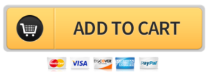
A call-to-action (CTA) button is a graphical element or text that prompts a user to take a specific action. In the context of Amazon’s design, CTA buttons are typically used to encourage users to purchase or take a particular action on a product listing. These buttons can take many forms, including “Add to Cart,” “Subscribe,” “Learn More,” and “Leave a Review,” among others. CTAs play an essential role in directing customers through the purchasing process and can increase the likelihood of a sale by making it easy for customers to take the next step. They are placed strategically to improve the design’s usability and drive the customer to the desired action.
Creating a Clear and Compelling Call-to-Action:
A critical element of designing a compelling call-to-action (CTA) button is making it clear and persuasive. The text on the button should clearly state the action that the user will take when they click it. For example, if the button is for signing up for a newsletter, the text should be “Sign Up” or “Subscribe.” Avoid using vague or generic phrases like “Learn More” or “Click Here,” as they do not give the user a clear idea of what will happen when they click the button.
Additionally, the design of the button should be visually compelling and stand out from the surrounding content. This can be achieved by using contrasting colors, different shapes, or other design elements to make the button pop. The CTA button should also be placed in a prominent position on the page, making it easy for users to find and click.
Finally, it’s essential to have a sense of urgency and scarcity in the CTA, encouraging users to take action immediately. This can be achieved by adding a sense of urgency to the copy on the button or by highlighting a limited-time offer or a sale.
In summary, creating a clear and compelling CTA button involves using precise, specific language and an eye-catching design, being placed prominently, and communicating a sense of scarcity or urgency.
30 great call-to-action buttons for amazon :
- “Add to Cart”
- “Buy Now”
- “Shop Now”
- “Explore Deals”
- “Limited Time Offer”
- “Get Yours Today”
- “Free Shipping”
- “New Arrival”
- “Best Seller”
- “New Release”
- “Upgrade Now”
- “Exclusive Offer”
- “Save big”
- “Hurry! Only a Few Left”
- “Discover More”
- “Join Prime”
- “Subscribe & Save”
- “Upgrade Your Gear”
- “Try Today”
- “Limited Stock”
- “Shop the Sale”
- “Don’t Miss Out”
- “Limited Time Discount”
- “Get Yours Before It’s Gone”
- “Upgrade Your Home”
- “Stock Up”
- “Last Chance”
- “Live Now”
It’s important to consider testing different designs and messages to determine which drives the most conversions for your product or service. Also, pay attention to the CTA’s language and tone; in some cases, it might be more effective to be more assertive, or in other cases, a softer approach can be more effective. Also, ensure that the button stands out visually and is placed prominently on the page.

Optimize CTA buttons:
- Use action-oriented language: Use language that communicates the action you want the user to take, such as “Buy now,” “Add to cart,” or “Learn more.”
- Make the buttons stand out: Use contrasting colors to stand out against the rest of the page. This can help to draw the user’s attention to the controls and make them more likely to click.
- Place the buttons prominently: Position the controls in a prominent location on the page, such as above the fold or close to the product’s price and availability information.
- Test different button sizes: Try testing different button sizes to see which size gets the most clicks. Larger buttons may be more attention-grabbing, but a smaller button may blend in less with the layout and have more whitespace.
- Make it simple: Make sure it’s evident what the user will get by clicking the button and what the expectations are.
- Use A/B Testing: consider A/B testing different versions of your buttons to see which one performs the best. This will help you to understand which design elements are most effective in driving conversions.
- You can also check Amazon’s Guidelines, which should have more specific instructions and best practices on how to design your pages to optimize conversions best.
Tips for increasing your conversion with the call to action button:
Call to action (CTA) buttons are a crucial element of any Amazon product listing, as they encourage customers to take the next step and make a purchase. To maximize conversions, it’s essential to ensure that your CTA buttons are clear, prominent, and appropriately placed on your listing.
One way to make your CTA buttons stand out is to use contrasting colors. For example, if your listing has a white background, consider using a bright color for your CTA button, such as red or orange. This will make the button more noticeable and draw the customer’s eye.
Another tip is to use action-oriented language on your CTA buttons. Instead of using generic phrases like “buy now” or “add to cart,” try using language describing what will happen when the customer clicks the button. For example, “Get yours today” or “Limited time offer – Order now.” This can create a sense of urgency and increase the likelihood of conversions.
Additionally, placing CTA buttons in multiple locations on your listing can help increase conversions. This is especially true for long listings, where customers may scroll down to view more information. Consider placing a CTA button at the top of the listing, in the middle, and at the bottom to give customers multiple opportunities to take action.
Furthermore, Using images of the product in different scenarios with a tagline of “Join the thousands of satisfied customers” or similar can be a great way to build social proof and increase conversions.

Another practical tip is to use countdown timers on your CTA buttons. This creates a sense of urgency and encourages customers to act quickly. For example, if you’re running a promotion that is only available for a limited time, you can use a countdown timer on your CTA button to let customers know how much time they have left to take advantage of the offer.
To maximize conversions with practical CTA buttons on Amazon, use contrasting colors, action-oriented language, multiple locations, product images in different scenarios, and countdown timers. With these tips, you can help increase conversions on your Amazon product listing and boost sales.
Final words:
In conclusion, implementing a clear and prominent call-to-action button on your Amazon product page can greatly improve conversion rates. The key to success is to make the button stand out visually, use action-oriented language, and place it in a prominent location on the page. Additionally, testing different variations of the button, such as color, size, and wording, can help to optimize its performance. Having multiple call-to-action buttons can also be effective, depending on what step of the conversion funnel the customer is in. Make sure you A/B test them to ensure you are using the most effective one. Furthermore, having a sense of urgency, like a limited-time offer or a low-stock warning, can also increase the likelihood of a customer clicking the button and completing a purchase. In summary, putting thought and effort into the design and placement of your call-to-action button can lead to a significant increase in conversion rates on your Amazon product page.
Frequently asked questions:
- What is a call-to-action button and why is it important for Amazon product pages?
A call-to-action button is a button that invites the user to take a specific action, such as making a purchase. It is an important feature on Amazon product pages because it encourages customers to complete a purchase, thereby increasing conversion rates.

2. Where should I place the call-to-action button on my Amazon product page?
The call-to-action button should be placed in a prominent and easily visible location on the product page, such as above the fold or near the product’s price. It should also be placed near related information, such as product details and customer reviews.
3. What kind of language should I use on my call-to-action button?
The language on the call-to-action button should be action-oriented and clear, such as “Buy Now” or “Add to Cart”. The language should also be consistent with the overall messaging on the product page.
4. How can I make my call-to-action button stand out visually on my Amazon product page?
You can make your call-to-action button stand out visually by using contrasting colors, making it larger than other elements on the page, or giving it a unique shape or design.
5. Can I test multiple versions of my call-to-action button?
Yes, you can test multiple versions of your call-to-action button to see which one performs better. This process is known as A/B testing and can be done through Amazon’s conversion rate optimization tools.
6. How can I create a sense of urgency for customers on my Amazon product page?
You can create a sense of urgency by highlighting limited-time offers or low-stock warnings, or by displaying a countdown timer for deals or promotions.